Parent brand Stacked composition
Stacked composition Brand library
Everything you need for a consistent Dry Ice identity. Logos, colours, typography and tools for everyday work.
 Clean technology. Precise results.
The foundation
One parent brand connects three divisions. Select a variant and download the prepared files. Always use the original artwork.
Stacked composition Horizontal composition
All 48 SVG logo variants, ready for digital use.
Brand palette
Blue Whale brings calm and precision. Ocean Green adds energy. Together with white, they form the foundation of every application.
Typography
One typeface for headlines and body text. Clear, precise and readable. Use only Regular 400 and Bold 700.
ABCDEFGHIJKLMNOPQRSTUVWXYZ
abcdefghijklmnopqrstuvwxyz
0123456789
Příliš žluťoučký kůň úpěl ďábelské ódy.
Aktiv Grotesk Regular and Bold are used in previews and PDFs. Install Aktiv Grotesk on your computer to edit Word and PowerPoint files; PDFs already include the font. The package below contains only freely available fallback fonts.
Download fallback fontsBrand guidelines
Preserve proportions, colours and clear space. Consistency begins with the details.
Keep at least half the pixel mark’s height clear on every side. Use a minimum height of 24 px for the horizontal logo and 48 px for the stacked logo.
Recommendations derived by the design system. The original brand files do not specify a mandatory minimum.Square pixels evoke dry ice sublimation. Use one motif at an edge, never behind text.
Use the parent Dry Ice logo on company-wide materials. Use division logos only for their own materials.
Write in a calm, factual register. Lead with the benefit and explain the process. Avoid superlatives and exclamation marks.
Brand in use
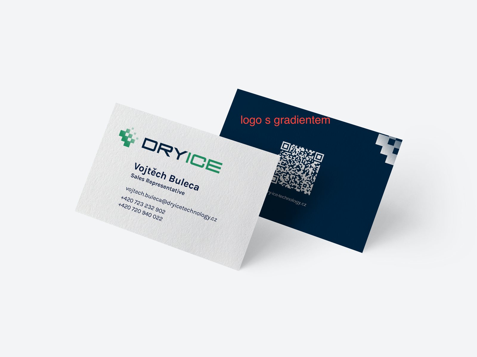
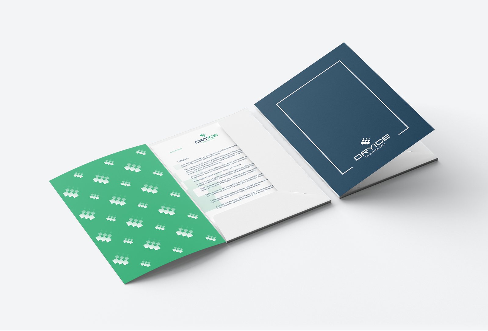
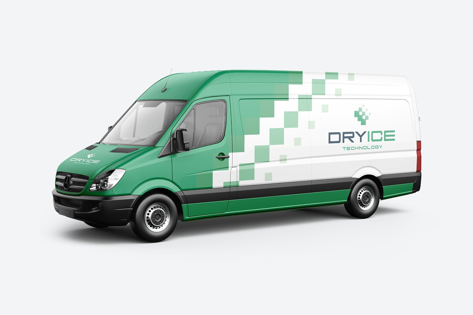
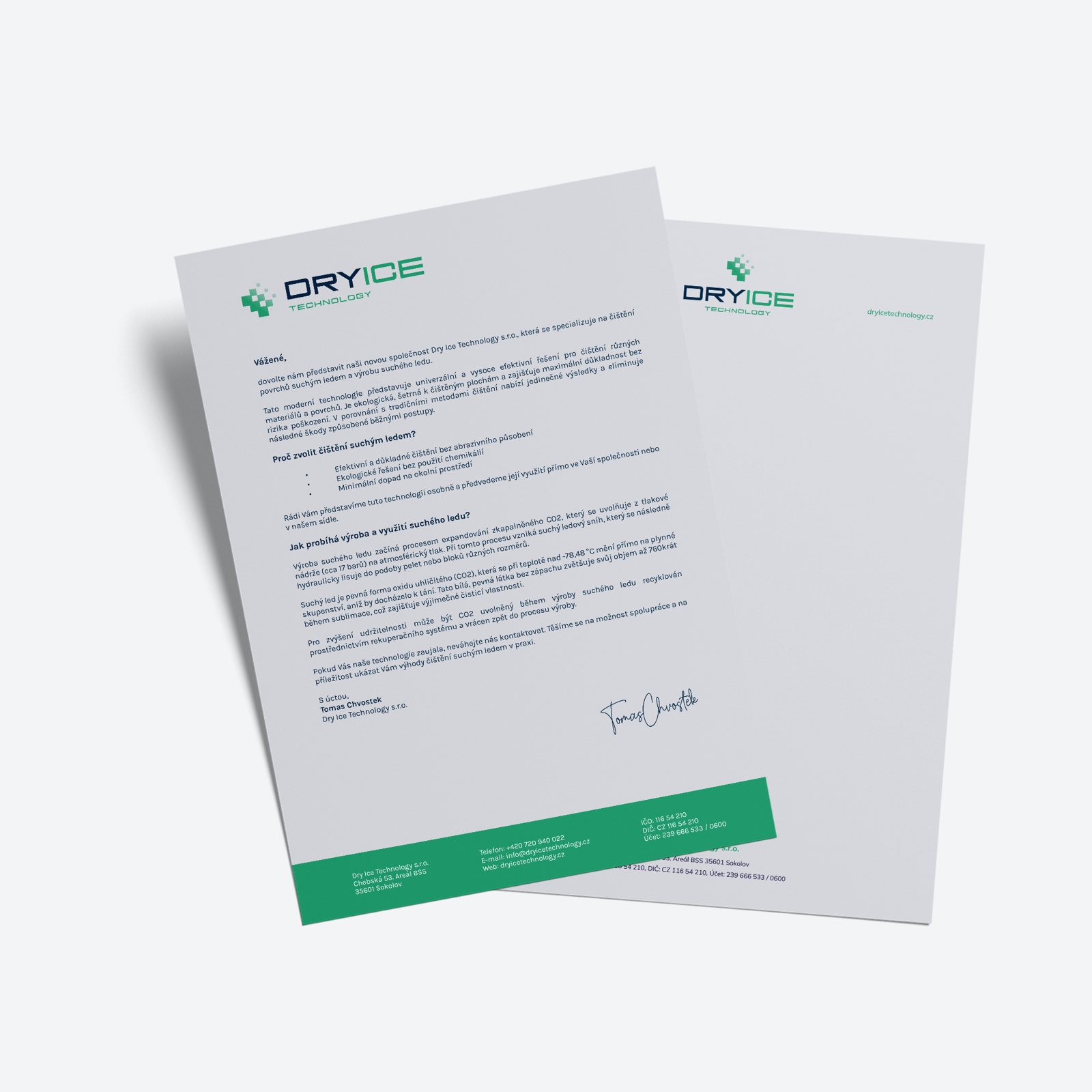
The original mockups show colours, frames and pixels in use. These are references with designer notes, not print-ready artwork.
Brand studio
Create a signature, business card or company document. With the right colours and the right details.